
Choosing paint colors for a living room can feel overwhelming when you’re staring at a dozen swatches taped to the wall. But here’s where an accent wall earns its keep: it lets you introduce color without committing every surface to a single shade. One wall painted in a bold or contrasting hue adds dimension, draws the eye to architectural features, and gives the room a focal point that works with your furniture and lighting. Whether you’re working with a fireplace wall, a long blank stretch behind the sofa, or an awkward nook, a thoughtfully painted accent wall can redefine the feel of the space without a full repaint.
Table of Contents
ToggleKey Takeaways
- An accent wall lets you introduce bold or contrasting color to your living room without committing every surface, making it a low-cost way to add dimension and a focal point in one weekend.
- The best living room accent wall candidates are those visible when entering the room, such as fireplace walls or walls behind furniture, while avoiding walls dominated by windows or doorways that fragment the color effect.
- Bold accent wall color ideas like deep navy, forest green, terracotta, and jewel tones work best in rooms with good natural light and lighter base walls for balance, while subtle palettes like warm neutrals and soft sage offer a calming alternative.
- Match your accent wall color with existing trim, flooring, and furniture—keeping white or off-white trim creates clean separation, and light flooring gives you more flexibility with deeper accent colors.
- Beyond flat color, techniques like horizontal stripes, ombré effects, and textured paint add custom visual interest, while eggshell finishes offer the most versatility for hiding imperfections and scrubbability.
- Proper surface prep including patching holes, sanding with 120-grit sandpaper, and priming (especially for drastic color changes) ensures even coverage and prevents wasted topcoat on your accent wall project.
Why Accent Walls Work Perfectly in Living Rooms
Living rooms typically have more wall real estate and architectural variety than other rooms, think fireplaces, built-ins, large windows, or open doorways. An accent wall leverages these features instead of competing with them.
From a practical standpoint, painting one wall uses less material and takes less time than a full room repaint. A gallon of quality interior paint covers roughly 350–400 square feet, so most accent walls require just one gallon, even with two coats. That keeps costs down and makes the project manageable in a weekend.
Accent walls also let you test bolder colors without risk. If a deep teal or charcoal gray feels too intense on all four walls, limiting it to one surface keeps the room from feeling closed in. The other three walls, usually in a neutral or lighter shade, provide visual relief and balance.
Finally, accent walls highlight what you want people to notice. A wall behind a media console, a fireplace surround, or a gallery wall becomes an intentional backdrop rather than an afterthought. It’s a low-cost way to add architectural interest to a builder-grade box.
Choosing the Right Wall for Your Accent
Not every wall is a good candidate. The best accent walls have a reason to be the focal point, either through existing architecture or how the room is used.
Start with the wall you see first when entering the room. If it’s unbroken by doors or windows and holds a key piece of furniture (sofa, media unit, or fireplace), it’s a strong contender. This wall naturally draws attention and benefits from a color shift.
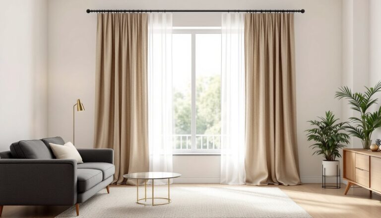
Fireplace walls are classic choices. The vertical lines of the chimney breast or stone surround already create a focal point: paint reinforces it. If the fireplace is off-center, painting the full wall, not just the chimney section, keeps proportions balanced.
Avoid walls dominated by windows or multiple doorways. You’ll end up painting around openings, which fragments the color and dilutes the effect. A wall that’s 60% interruption won’t read as an accent, it’ll just look incomplete.
Consider sightlines from adjacent rooms. If your living room opens to a dining area or kitchen, the accent wall will be visible from multiple angles. Make sure the color works in context, not just when standing in the living room.
Test the wall’s condition before committing. Accent walls get scrutiny, so surface prep matters. Patch any holes with lightweight spackle, sand smooth with 120-grit sandpaper, and prime if you’re making a drastic color change (especially dark over light or vice versa). Skipping primer leads to uneven coverage and wasted topcoat.
Bold and Dramatic Accent Wall Color Ideas
If you want the accent wall to make a statement, go darker or more saturated than your base walls. These colors anchor the room and add weight without paint on every surface.
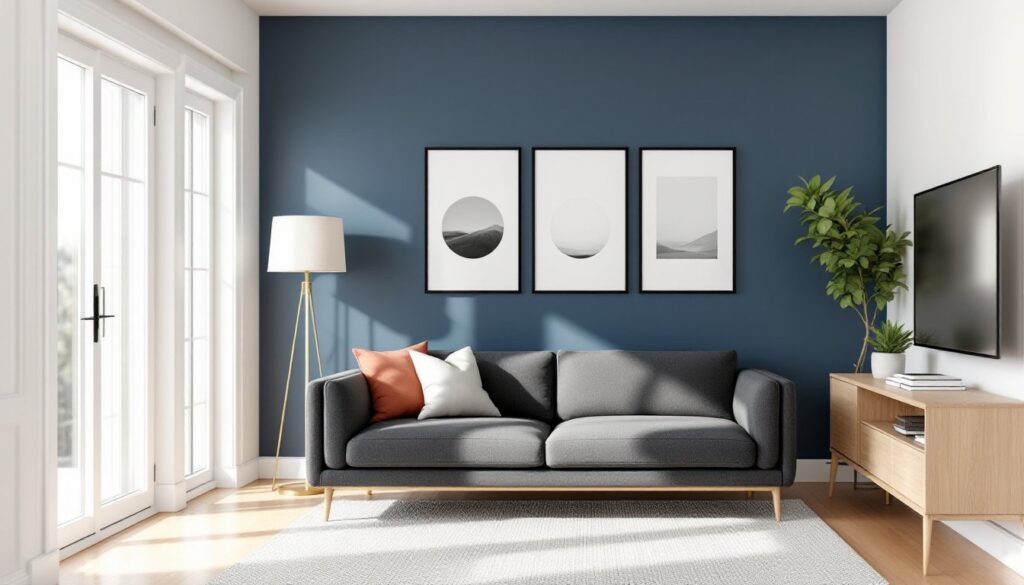
Deep navy or charcoal works well in living rooms with good natural light. The color reads rich instead of gloomy, and it pairs easily with warm wood tones, brass fixtures, and neutral upholstery. Navy also provides contrast for white trim and artwork without the starkness of black.
Forest green or hunter green has come back strong. It feels grounded and sophisticated, especially when the rest of the room uses cream, tan, or soft gray. Green accent walls complement leather furniture and plants without going full tropical.
Terracotta or burnt sienna adds warmth and works in spaces with Southwestern, mid-century, or eclectic styles. These earthy tones soften the room without feeling pastel, and they photograph well in afternoon light.
Black is polarizing but effective in the right context. It works best on a single wall in a room with high ceilings, large windows, and lighter-colored furniture. Black emphasizes negative space and makes colorful art or shelving pop. Use a matte or eggshell finish to avoid a chalkboard look.
Many of these designer accent wall ideas show how dramatic color choices create focal points in living spaces.
Jewel tones, emerald, sapphire, or amethyst, introduce color intensity without going primary. They work in rooms with plenty of white or light gray to balance the saturation. Keep the sheen low: eggshell or satin finishes prevent the wall from looking too glossy under evening lighting.
Soft and Subtle Accent Wall Palettes
Not every accent wall needs to shout. Subtle color shifts create depth and warmth without drama, and they’re easier to live with long-term.
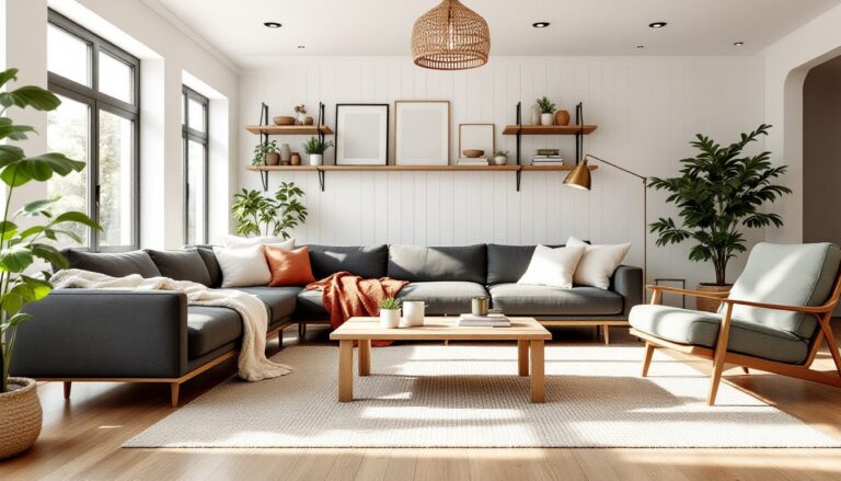
Warm neutrals, greige, taupe, or soft beige, can serve as accent colors when the rest of the room is pure white or cool gray. The slight contrast adds dimension without demanding attention. This approach works in minimalist or Scandinavian-inspired rooms where texture and light matter more than bold color.
Pale blush or dusty rose introduces warmth and softness without reading as overtly feminine. These tones work well in rooms with natural wood floors, linen upholstery, and plenty of white. They’re forgiving in mixed lighting and pair well with brass or matte black hardware.
Soft sage or celadon green provides color without intensity. These muted greens feel fresh and calming, and they bridge warm and cool tones. They’re a good fit for living rooms that open to outdoor spaces or have large windows facing greenery.
Light gray-blue or slate blue offers a cooler alternative to standard gray. It works in north-facing rooms or spaces with warm wood tones that need a cooler counterpoint. Avoid true baby blue, it skews nursery. Stick with grays that lean blue rather than blues that lean bright.
Monochromatic shifts are an option if you’re nervous about color. Paint three walls in a light shade (say, a pale gray) and the accent wall in a mid-tone of the same color family (medium gray). The result is subtle but effective, especially when combined with varied textures.
Coordinating Your Accent Wall with Overall Room Colors
An accent wall doesn’t exist in isolation. It needs to work with your trim, ceiling, flooring, and furniture.
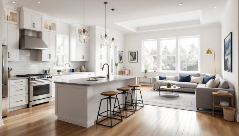
Start with your base wall color. In most cases, the three non-accent walls should be neutral enough to let the accent wall stand out. White, off-white, light gray, and greige are common choices. If you’re painting everything fresh, do the base walls first so you can test accent colors against the actual neutral, not a swatch.
Match or contrast your trim. White or off-white trim creates clean separation and works with almost any accent color. If your trim is stained wood, make sure the accent wall color doesn’t clash with the wood tone. Warm woods pair well with greens, terracottas, and warm grays. Cool-toned woods work with blues, charcoals, and soft grays.
Consider your ceiling. Standard white ceilings are safe and keep the room feeling taller. If you’re painting the accent wall a dark color, keeping the ceiling white prevents the room from feeling compressed. Some budget home renovation projects extend the accent color onto the ceiling for a more enveloping effect, but that’s a bolder move best suited to small spaces or rooms with high ceilings.
Factor in flooring. If you have dark hardwood or luxury vinyl plank, a dark accent wall can make the room feel heavy. Balance it with lighter base walls and plenty of white or cream in the furnishings. Light flooring gives you more flexibility with deeper accent colors.
Pull colors from existing furniture or art. If you have a rug, throw pillows, or a large piece of art with colors you love, use those as a starting point for the accent wall. This creates cohesion and makes the room feel intentionally designed rather than randomly painted.
Techniques and Finishes for Extra Visual Impact
Beyond flat color, you can add texture or pattern to an accent wall for a more custom look. These techniques take more time but stay within DIY territory.
Textured paint or Venetian plaster adds subtle dimension. Textured paints contain fine aggregates that create a slightly rough surface. Apply with a roller or trowel, depending on the product. Venetian plaster requires more skill, it’s applied in thin layers with a trowel and burnished to a smooth, slightly glossy finish. It works well in Mediterranean or transitional styles.
Horizontal or vertical stripes introduce pattern without wallpaper. Tape off sections with painter’s tape rated for delicate surfaces (FrogTape or 3M Delicate Surface), and use a level to keep lines straight. Alternate colors that are close in value for a subtle effect, or go high-contrast for drama. Remove tape while the paint is still slightly tacky to avoid peeling.
Ombré or gradient effects blend one color into another, usually from dark at the bottom to light at the top. This technique requires blending wet paint with a large brush or sponge roller, working in horizontal sections. It’s time-sensitive and best done with a helper. Expect some trial and error.
Board and batten or shiplap adds architectural texture. Install 1×4 or 1×6 pine boards horizontally (shiplap) or vertically with a cap rail and baseboard (board and batten), then paint the whole wall in your accent color. This adds depth and works especially well in farmhouse or coastal styles. Expect to spend a weekend on installation and finishing if you’re new to trim work.
Finish matters as much as color. Flat or matte finishes hide imperfections and create a velvety look, but they’re harder to clean. Eggshell is the most versatile, low sheen, scrubbable, and forgiving under most lighting. Satin has more sheen and works in high-traffic living rooms, but it can highlight wall flaws. Avoid semi-gloss or gloss unless you’re painting trim or want a lacquered look.
For more interior design inspiration and paint techniques, exploring professional examples can help refine your approach before committing to a specific finish.
Conclusion
An accent wall offers a straightforward way to add personality and depth to a living room without the commitment or cost of a full repaint. Whether you lean toward bold, saturated hues or soft, neutral shifts, the key is choosing the right wall, coordinating with existing elements, and prepping the surface properly. With the right color and finish, one wall can redefine how the entire room feels, and it’s a project most DIYers can tackle in a weekend.